TABLE OF CONTENTS
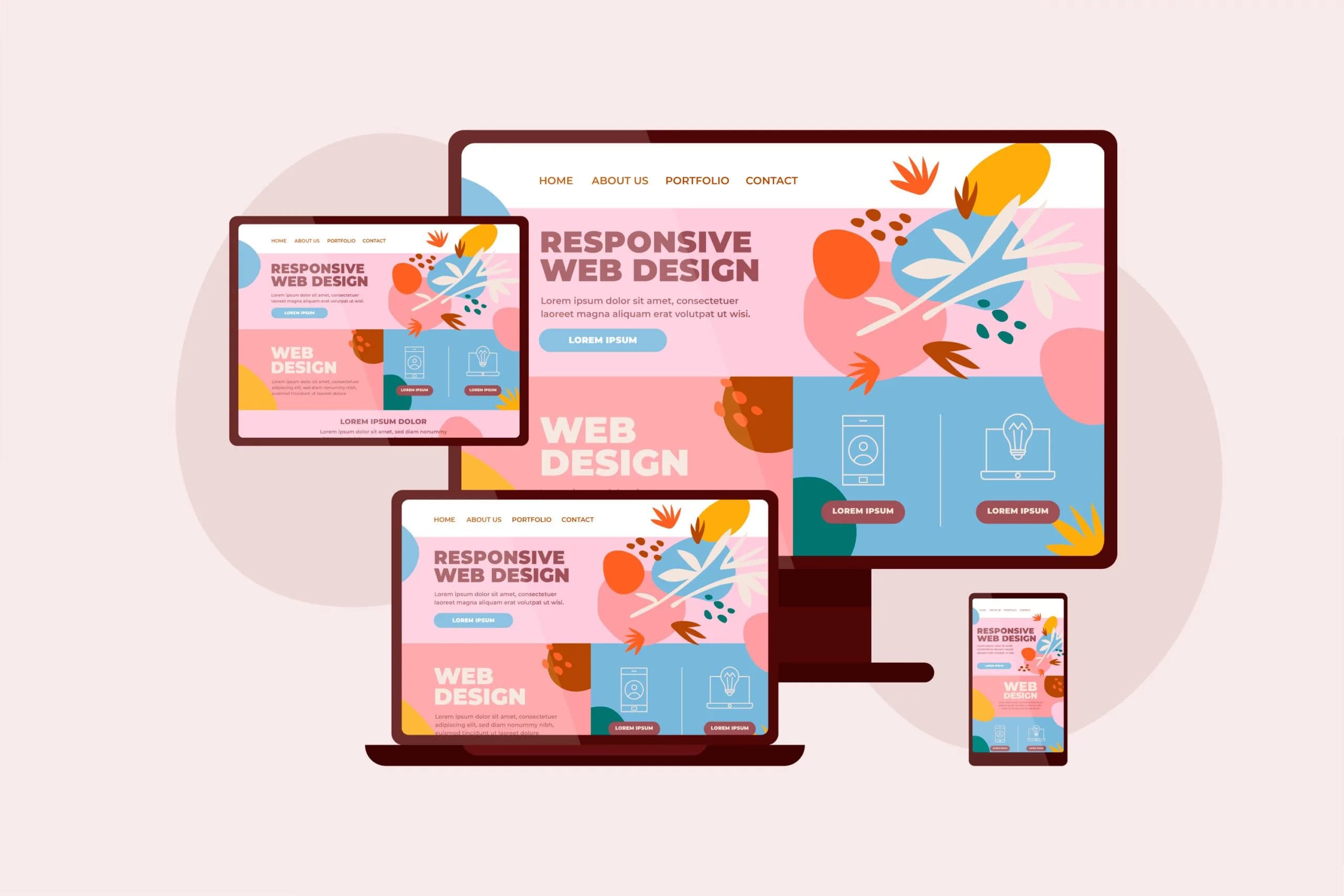
People access websites through many devices, including phones, tablets, laptops, and desktop computers. A professional website should remain readable and usable across all of these screens. Responsive web design is one of the main approaches to achieving that goal.
What is responsive web design?
Responsive Web Design is an approach to building interfaces that adapt their layout and elements to the available screen space. For example, a three-column layout on desktop can become a single column on mobile to make content easier to read.
Why does responsive design matter?
- Visitors can use the site without constant zooming or unwanted horizontal scrolling.
- The experience feels more consistent across devices.
- Businesses can make products, services, and information available to more people.
Responsive design and SEO
Google primarily uses the mobile version of content for indexing across many websites. Responsive layouts help keep content accessible across screen sizes, but responsive design alone does not guarantee higher rankings. Content quality, performance, accessibility, and technical structure also matter.
Core techniques
CSS Grid
CSS Grid is useful for flexible multi-column layouts. You can adjust the number of columns and the spacing between them based on available width. It works well for service cards, portfolios, and product grids.
Flexbox
Flexbox helps arrange elements in rows or columns and control their alignment and spacing. For example, header elements can sit side by side on large screens and change their arrangement on small ones.
Media queries
Media queries let CSS apply different styles under specific conditions, such as a viewport width. Breakpoints should be chosen according to the content and layout rather than specific device names.
The code below uses three columns by default and switches to one column on screens narrower than 768 pixels. The 768 value is only an example and should be adjusted to the actual design.
.cards {
  display: grid;
  grid-template-columns: repeat(3, minmax(0, 1fr));
  gap: 24px;
}

@media (max-width: 768px) {
  .cards {
    grid-template-columns: 1fr;
  }
}
Responsive images
Images should not exceed the width of their containers. The code below keeps an image inside its parent and preserves its proportions. Image compression and appropriate formats also improve performance.
img {
  max-width: 100%;
  height: auto;
}
The mobile-first approach
Mobile-first design starts with smaller screens and progressively adds styles and features for larger displays. This can help prioritize essential content and simplify the interface. The earlier example, written mobile-first, looks like this:
.cards {
  display: grid;
  grid-template-columns: 1fr;
  gap: 24px;
}

@media (min-width: 768px) {
  .cards {
    grid-template-columns: repeat(3, minmax(0, 1fr));
  }
}
React and Tailwind CSS
React lets developers build interfaces from reusable components. Tailwind CSS provides responsive utilities such as grid-cols-1, md:grid-cols-2, and lg:grid-cols-3 that make responsive layouts quick to write.
<div className="grid grid-cols-1 gap-6 md:grid-cols-2 lg:grid-cols-3">
  <Card />
  <Card />
  <Card />
</div>
These tools simplify implementation, but they do not guarantee a good design, and the result still needs testing.
Common mistakes
- Excessive fixed widths.
- Small buttons and tap targets.
- Unreadable text on small screens.
- Oversized images.
- Hiding important content without a clear reason.
- Testing only one screen size.
How to test a responsive website
The Device Toolbar in your browser's Developer Tools simulates different viewport sizes. Use it to check the following:
- View pages at a range of widths.
- Check navigation menus and forms.
- Make sure there is no unwanted horizontal scrolling.
- Finally, test on real devices too.
Accessibility in responsive design
A responsive website should work for as many people as possible. These considerations matter most:
- Good color contrast.
- Semantic HTML.
- Descriptive alternatives for images.
- Visible keyboard focus.
- Full keyboard navigation.
Conclusion
Responsive design is a core part of modern web development. Combining CSS Grid, Flexbox, media queries, flexible images, and regular testing helps you build sites that work well across devices. Content quality, performance, and real user needs remain just as important.